|
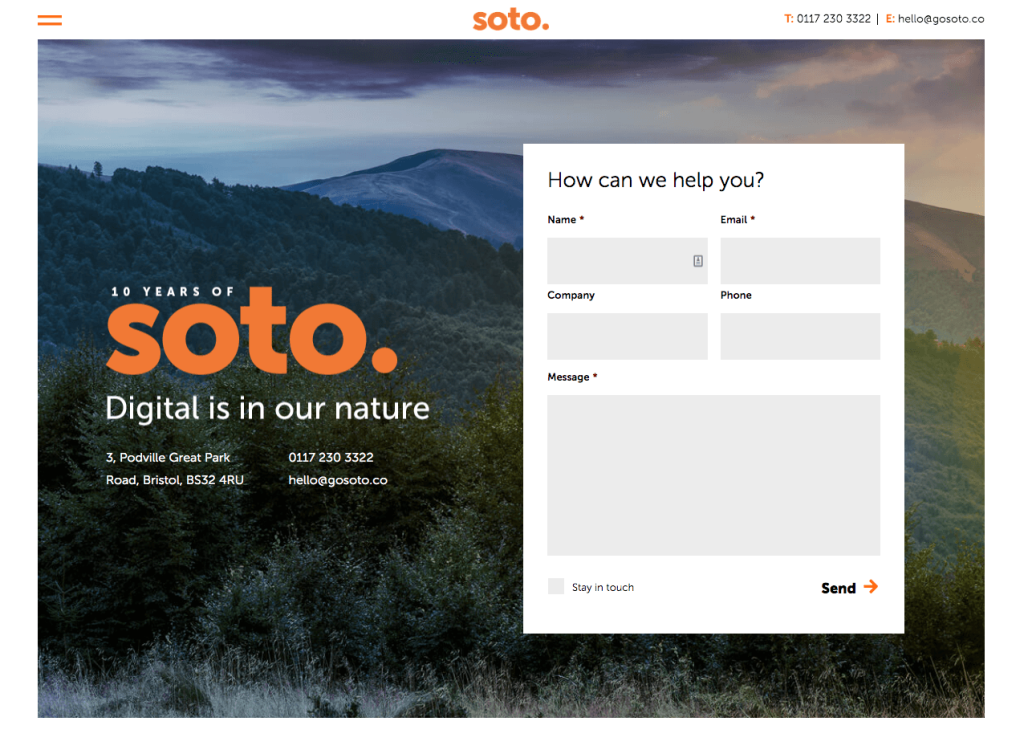
Never underestimate the power of usability when it comes to your website’s contact form. It’s one of the most important tools you have to connect with visitors to your site – often used for maintaining ongoing relationships and, very importantly, starting new ones.
|
|
Careful form design that gives your users a seamless, easy to use way to get in touch with you, is the key to a successful contact form. A big factor to consider is the speed with which a user can understand and accurately complete a form. Following a few simple usability guidelines will reduce form completion time significantly, and help make sure forms are submitted on the first try, without any errors. A recent paper published in CHI by Seckler and her colleagues shows that following a few simple usability guidelines can reduce completion time significantly, and that users are almost twice as likely to submit the form when there are no errors on the first try (78% one-try submissions in forms that were compliant with usability guidelines, versus only 42% one-try submissions in forms violating them). |
|
The best solution will depend on the type and length of the form, and the data that it collects, so designs will always vary, but for best practice, the guidelines below should always be considered:
|
| 1. Keep it as short as possible |
| Remove fields that collect information that can be derived in some other way, collected more conveniently at a later date or simply omitted. |
| Every time you cut a field or question from a form, you increase its conversion rate! |
|
| 2. Display fields in a single column Multiple columns can make it difficult to follow the natural flow of moving down a form, so try to limit yourself to one field per row of your form. |
| There are exceptions to this rule: City, Country, Postcode (short or logically related fields can be displayed on the same row). |
|
|
| 3. Don’t use placeholder text |
Lots of web designers like adding placeholder text to form fields because it avoids visual complexity, removing the need for field labels, but in return it causes many usability problems:
For best practice, put the field placeholder above the field, add hint text outside the box and keep the form fields themselves clear. |
| 4. Group related labels and fields |
| Labels should be close to the fields. For mobile and shorter desktop forms the label should be immediately above the field. For fairly long forms the label can be next to the field as there is no need to make the form any longer by adding extra rows for the fields. Try to avoid ambiguous spacing, and include the label attribute for users using screen readers. |
| 5. Think carefully about the type and size of fields |
| Try to avoid drop-downs when there are only 2 or 3 options, and instead use radio buttons or check boxes that only require one click. Text fields should be the same size as the expected input so that text doesn’t become hidden as more is added. |
| 6. Distinguish between optional and mandatory fields |
| Eliminate as many optional fields as possible to keep the form short. Try to limit them to 1 or 2 and clearly label them as optional. |

|
| 7. Explain formatting requirements |
| Try to avoid any field formatting rules if you can, but if a form field does have a formatting requirement, such as special characters in a password, or numerical characters only in a telephone number field, provide instructions to the user – help them to be successful on their first try. |
| 8. Don’t provide ‘Reset’ or ‘Clear’ buttons |
| The risk of users accidentally deleting a submission greatly outweighs the need to clear the fields and start again. If you’re collecting sensitive information such as bank details, you can provide a ‘cancel’ button to support those who decide not to go ahead and want to delete their information, just be sure the submit button is must more prominent than the cancel button. |
| 9. Provide highly visible and specific error messages |
| Make your error messages helpful – give people a place to fine more information and steps they can take to mitigate their problem. |

|
| 10. Review and test your forms regularly! |
| If you take anything away from this article, it’s to go and check your website forms now! Even if you follow all the rules above, if it’s not working, it won’t matter! We’ve had countless instances where we’ve taken over management of a client’s website, only to find that their contact form hasn’t been working at all. |
|
Make sure you’re not doing any of the faux pas above – and if you are, get in touch! |
How well is your contact form working for you?
Our top tips on how to make the most of what is probably the most important part of your website; your contact form.


Further Thoughts
If you have ever visited your website after we have made updates and thought, “That is not what I was expecting,” you’re not alone.
We’re proud to share that Soto Digital is now a Certified B Corporation® - a milestone that recognises our commitment to using business as
We donated £500 to FareShare South West through The Big Give, doubling its impact to support food redistribution and provide vital meals across the
Here at Soto, we talk a lot about what we do... but what about how we do it?